Luzi Type Koper font
Kop

Koper

Koper merges the craft of calligraphy with the rugged natural texture of woodcut artwork. It takes cues from the Art Nouveau creations of Czech artist Vojtěch Preissig. This font is meticulously crafted with linear strokes, providing it with a distinct aesthetic appeal.

At smaller sizes, Koper exhibits a traditional aesthetic and functional flexibility, making it an excellent option for various typographic purposes. When displayed at larger sizes, the typeface’s genuine elegance becomes apparent, emphasising its straightforward yet striking design and creativity.

The typeface is available as individual weights and as a variable font with a Regular → Display axis. The family package includes two variable fonts: upright and italic.

Zoisite Argémnite
Dati mantengono Precisione Les repères donnent direction Steel meets smooth Texture fabrique de montres précises Function drives Simplicity Ogni bordo definisce forma Les angles gardent logique
Los Pirineos son más antiguos que los Alpes; sus primeros sedimentos se depositaron en cuencas costeras del Paleozoico y Mesozoico. Entre 100 y 150 Ma, en el Cretácico Temprano, se abrió el golfo de Vizcaya y la placa Ibérica rotó levemente frente a Eurasia, empujando a España contra Francia e imponiendo compresión sobre grandes paquetes sedimentarios. La compresión invirtió cuencas, plegó y cabalgó estratos y generó fallas de vergencia norte y sur, formando dos cuencas de antepaís: Aquitania y Ebro, colmadas con sedimentos gruesos del núcleo en ascenso. La presión y el levantamiento iniciaron en el este y avanzaron por la cadena, con máximo en el Eoceno–Oligoceno, cuando se fijaron gran parte de las altitudes y un metamorfismo regional moderado afectó el núcleo. En el este dominan granitos y gneises del basamento varisco, intruidos y metamorfoseados en el Paleozoico y exhumados en la orogenia pirenaica; la Zona Axial expone niveles profundos. Afloran Canigó, Maladeta y Carlit, con relieves abruptos y valles profundos pero anchos, por la resistencia del granito. Hacia el centro y el oeste cambia la arquitectura: cumbres graníticas quedan flanqueadas y, a menudo, cubiertas por calizas, margas y flysch mesozoicos y paleógenos en láminas imbricadas que forman sierras escalonadas. El flysch, con turbiditas rítmicas, transmite la deformación y se erosiona en escarpes. Este contraste explica la coexistencia de cumbres calcáreas como Monte Perdido (3.355 m) con picos graníticos como Aneto (3.404 m) y Vignemale (3.298 m). El aspecto macizo obedece a la abundancia de granito, resistente a abrasión y ataque químico.
The International Typographic Style reshaped graphic design within the modernist movement, influencing adjacent disciplines from architecture to the arts with a rigorous, rational clarity. It emphasises cleanliness, legibility, and objectivity. Its signatures include asymmetric compositions, disciplined grids, sans-serif typefaces, and a flush-left, ragged-right setting. The approach also privileges photography over illustration when facts must speak plainly. Early exemplars treated typography not only as text but as form itself, and from this primacy the style took its name. It grew from the wish to present information without rhetorical noise, minimising connotation to foreground structure. As a modernist graphic current, it aimed to communicate messages with lucidity and in a language anyone could read. Born in Switzerland and Germany in the 1950s, it drew on Bauhaus thinking and the International Style in architecture, seeking ordered systems that could be scaled and repeated. Designers advocated rigorous grid frameworks, scrupulous margins, and ample white space. Neo-grotesque sans-serif families became emblematic, valued for optical neutrality and even rhythm. Hierarchy was established through size, weight, spacing, and alignment rather than ornament; photographs served as evidence rather than decoration. This discipline shaped corporate identity programmes, transport signage, wayfinding, editorial layouts, and information graphics, where clarity and consistency are mission-critical. In practice, it meant modular grids, that render dense material instantly legible.
Wie an Land gibt es im Meer Höhen und Tiefen. Berge unter dem Meer sind teils höher als Gipfel an Land, Gebirge länger, Schluchten tiefer als auf dem Festland. Setzte man den höchsten Berg (8847 m) in die tiefste Meeresgrube, lägen über seinem Gipfel noch etwa 2186 m Wasser. An Land zermürbt Erosion das Gestein dauernd; in der Tiefe bleiben Gebirge meist still und weitgehend unversehrt im kalten, dunklen Wasser. Nur wo ihre Spitzen die Oberfläche erreichen und als Inseln ragen, greifen Wind, Wellen und Regen an und formen Küsten, Klippen und Strände. Unter der Oberfläche wirken andere Kräfte: Rutschungen, Trübeströme und Meeresströmungen tragen Material, graben Rinnen und Täler und breiten Sedimente zu weiten Ebenen aus. Vulkane bauen viele Unterseeberge; manche wachsen bis über die Oberfläche und bilden Inselketten, andere werden durch Wellen zu flachen Tafelbergen, den Guyots. An den Mittelozeanischen Rücken, dem längsten Gebirge der Erde, tritt ständig neue Kruste aus dem Mantel aus und schiebt Platten auseinander; an Tiefseegräben sinken Platten ab, bilden Inselbögen und heben grosse Faltengebirge. Der Meeresboden hat drei Teile: Schelf, Kontinentalabfall und Tiefseeboden. Der Schelf ist der flache, sanft zum Meer geneigte Rand der Kontinente; er reicht oft nur Dutzende bis wenige Hundert Kilometer weit und meist nur ein paar Hundert Meter tief. Hier sammeln sich dicke Lagen aus Flussfracht, Staub und organischem Material; darum sind Schelfmeere fruchtbar.
Regular
Regular Italic
SemiBold
SemiBold Italic
Bold
Bold Italic
Display

Formats

Desktop: otf (PS)
Variable Desktop: TTF-Variable-Font
Web: woff / woff2  /
Web Variable: woff / woff2 
App: otf (PS) / TTF-Variable-Font
Variable App: TTF-Variable-Font

Language Support

Basic Latin, Latin-1 Supplement and Latin Extended-A.

Afaan Oromo Bemba Bosnian Catalan Croatian Czech Danish Dutch English Estonian Filipino Finnish French German Hungarian Indonesian Irish Italian Ilocano Javanese lat. Kurdish lat. Latvian Lithuanian Malay Norwegian Polish Portuguese Quechua Romanian Romansh Slovak Slovenian Spanish Swahili Swedish Tagalog Turkish Wolof Zulu
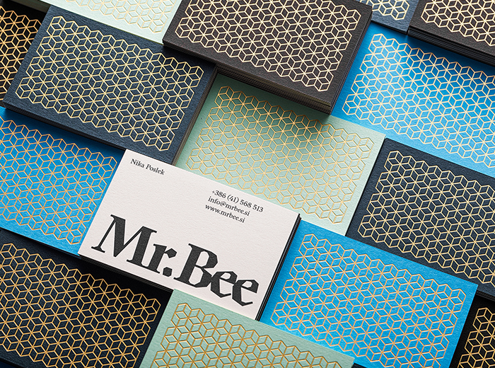
..see the complete list here!


A
A U+0041
Ligatures
Sofia Sofia
Case-Sensitive Punctuation
¿Hola? ¿Hola?
(Default) Proportional Lining Figures
$1024
Tabular Lining Figures
$1024 $124
Superscript
m3
Ordinals
5a5o 5ª5º
Fractions
15/32 15/32
Numerators and Denominators
2H5 2H5
Beirut Font Luzi Type Foundry

Featured in the notes: Designer Diano Kitanovski created the visual identity for the honey company Mr Bee.

show all Typefaces