
My first studio in Bern 2013, photo Matías Aros

Early sketch of the typeface Cádiz, 2013
My first studio in Bern 2013, photo Matías Aros
Early sketch of the typeface Cádiz, 2013
In 2013, fresh out of my visual communication studies, I was eager to find a job, best in an innovative and interesting graphic design studio.
Running around from Bern to Zurich with my portfolio in hand, but luck was not on my side.
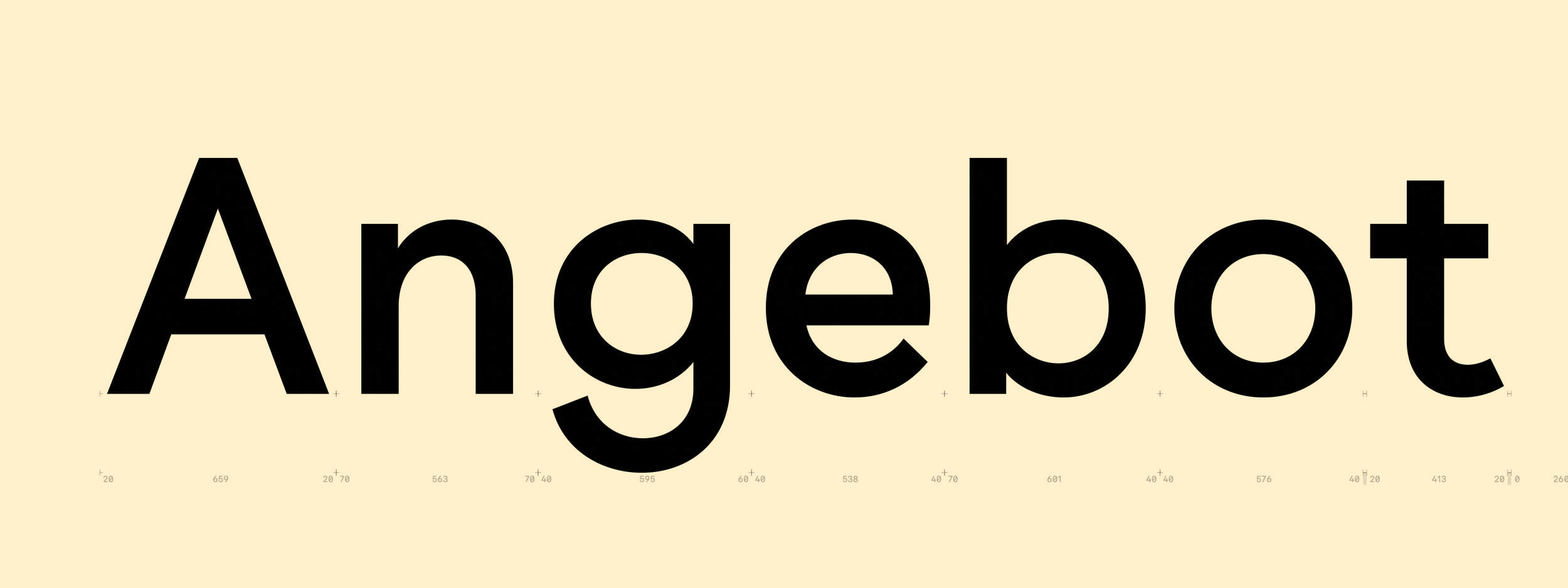
During these challenges, I found myself with spare time, which led me to experiment with quirky sans serif fonts.
At the time, unconventional grotesque fonts were fashionable, at least in my university.
Starting type design doesn’t require much financial investment; all I needed was time, a computer, a type editor, paper, and a scanner.
Weeks passed, and my portfolio efforts bore no fruit.
In a moment of self-reflection, I contemplated opening my own design studio, despite my lack of expertise in acquiring clients.
It was a crucial decision that set the base for Luzi Type; when no one called, I took the initiative.
Thus, I registered the domain Luzi-Type.ch and launched my first website, showcasing my first typefaces, Buenos Aires, Beirut and Cádiz.
When I released my first fonts, I was hesitant to publish them, fearing they wouldn’t be perfect.
I struggled to determine when something was truly finished.
However, with time, I learned the importance of sharing my work, testing it, and publishing it so I can observe the fonts from a certain distance to gain a more objective perspective and make necessary improvements.
Version 2013 of Buenos Aires

Version 2013 of Buenos Aires

Version 2013 of Buenos Aires
After studying design, I followed the custom of undertaking apprenticeships to explore diverse design approaches in a new context.
My curiosity led me to South America, where I found a position in Santiago de Chile.
Little did I know that this decision would shape the trajectory of my twenties.
Later, I also apprenticed at Dalton Maag, learning a lot about type design.
My girlfriend and I chose to live together in Montevideo; where I worked obsessively on my font catalog, adding Messina Sans, Messina Serif and Messina Modern. Living in Uruguay allowed me to focus on my work as we didn’t know many people there, and Montevideo has a calm atmosphere.
Despite that, the place inspired me with new ideas, particularly for Recife (see essay The Inside).
In 2015, we made the move to Valparaíso, where our daughter was born, filling our lives with joy.
Being a new dad also helped me achieve a healthier work-life balance.
My view from the office in Valparíso
Valparaíso is a city known for its spirit of improvisation and self-initiative, which is reflected in its street typography (see notes entry Typographic Souvenirs №1).
During this time, I worked diligently from my office, enjoying the beautiful view of the Pacific as I completed my typefaces Lynstone, Koper, and Recife.
In 2019, we relocated once again, this time to Bern, where my office is now situated in the charming old town.
Over the last 10 years, I’ve experienced a challenging learning curve, encountering both highs and lows, a lot of moments of self-doubt, and plenty of fun as I strived to do my best.
If I could offer advice to my younger self, it would be: “You have to start somewhere.”
Nowadays, my published typefaces are much more settled, receiving occasional minor technical updates.
Nevertheless, I still find myself excited whenever I encounter a new letterform or complete work on a new typeface.
I want to say a big thank you to all my clients for their continuous support over the years, which made this journey possible!
